

The classic analysis mistake marketers and founders make
If you run a survey or conduct interviews, make sure you're taking this one critical step

“But how do we actually get better at analyzing data like this?” my client asked. She’s an up-and-coming marketer who was recently promoted to Head of Marketing at a growing B2B SaaS company. She’s bright, young, and determined to do her best in the role. “We can’t always depend on you to analyze the data for us. We have to learn on our own, but how?”
I admit — she had an extremely fair point.
We’ve been working together on growing the business since February 2023, and for the last 6 months, we lifted MRR by about 54% from then until now (an incredible feat since growth was stagnant for the 6 months prior).
But there have been a few speed bumps along the way — such as getting stuck on when to collect information or insights, how to analyze the results, and then translating those insights into action.
And now, she was asking a great question…
How does one get better at analyzing data — even if you’re not an analyst?
What’s different about how we analyze information at DemandMaven versus the typical process that most people do?
A survey with good intentions
It all started when the team made a particular assumption about their growth. They had a hypothesis that the website wasn’t performing as well as it should, so they immediately starting rattling off ideas on how to improve it.
Ideas ranged from changing the text of the button to writing new homepage copy for the third time to adding a banner at the top of the website offering a new CTA.
I called a timeout: We know the website isn’t performing as well as we’d like, but how do we know it’s not the quality of the website visitors? Perhaps it’s possible this isn’t the right traffic in the first place and adjusting the design is going to make very little difference?
The team stared back at me. They had considered this once before, but the last time they had the conversation, it spiraled into more projects that they were hesitant to commit to.1
“So how do we figure out if it’s the traffic or not?”
I smiled. “We run a website survey!”
And with that, they start crafting a very simple, short-and-sweet 5-question website survey. The goal was to understand the quality of the traffic while also gathering an extra data point around their preferred sales touchpoints (such as if they’d prefer to book a demo versus starting a trial).
I cautioned against taking the answers to questions like these too seriously since it’s rare that customers will agree that they needed a demo in order to make a purchasing decision, but I waved it off.
In keeping it simple, we needed to know just a few things to determine their quality:2
What was their role
How big was their organization
How often did they need to accomplish the “job”3
What types of documents they needed while accomplishing that job
What was their goal for visiting the website (including if they were customers and they just wanted to login)
We conducted qualitative research at the beginning of the year and discovered that the ideal paying customer tended to be a marketer of a global organization that needed to manage the process of accomplishing a very specific job. They also needed that job to support many different types of documents (since this is also what created a lot of the pain and triggered a search for a solution).
We then later validated this hypothesis by quantitatively analyzing the profiles of the best paying customers from the last 6 months and found a similar trend.
With this new website survey, we hoped we would see the same pattern repeated, but of course if we weren’t attracting the right audience (or enough of the right audience) then we knew to invest our efforts in different areas.
This is one of the benefits of collecting insights: whether it confirms or disproves your hypothesis, it empowers you to take the next step.
We launch the survey and watched the responses pour in.
After about two weeks, the marketing team excitedly reports on their findings.
Here’s the gag, though: the way most people will analyze the results of a survey is to look at the top-level charts and graphs that most survey tools will automatically generate, and then they’ll stop there. They won’t dig deeper.
For example, if you run a survey using Google, it will summarize the results for you in a pretty summary report in the aggregate — meaning it’s looking at all of the survey responses and telling you overarching highlights.
Most people will look at each of these charts and graphs and parrot back the summary of the survey.
Except, this wouldn’t technically be giving you the best, most accurate insights.
It’s actually a trap to just stop at the pretty graphs SurveyMonkey or Google spits back out at you.
Let’s break down why:
Where most analysis goes awry
Accepting the aggregate can often be a fatal misstep to understanding the true implications of your research findings.
For example, if we only looked at the aggregate, we can assume from below that the majority of people visiting the website are looking to accomplish the desired job, but for file type #2 (which for this particular company didn’t create the best buying scenarios).
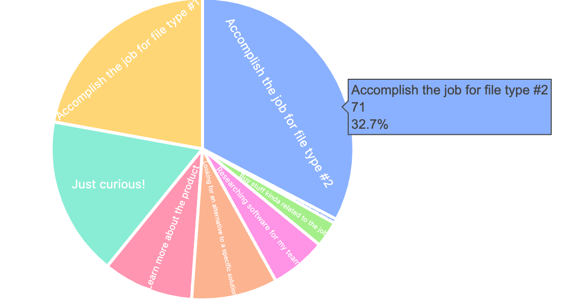
But remember — this is looking at the aggregate, the collective. This represents everyone who responded to the survey, regardless of whether they were qualified or not.
What if we just looked at what the target ICP wanted to do? In this case, that would be marketers at organizations with more than 500 employees in this context.
When we filter everything to focus on just that data, it turns out that their top goal is to accomplish the job, but with file type #1 — the more desirable file type that generally created more buying scenarios of the software. Interestingly, there’s also a large portion of this target audience who were “just curious” and likely didn’t have a real need to purchase.

How did we get there? By segmenting the data.
At DemandMaven, we use and recommend using Airtable to quickly filter and segment data (much like you would a SQL database). You can use it to display a live, real-time chart as you add filters and view a myriad of segments.
This could be achieved for free with Google Sheets and charts, however, if Airtable is out of the budget.
If we never segment the data, we never arrive at interesting takeaways like this.
This told the marketing team everything they needed to know about how to adjust their strategy. I explain why at the end of this post.
Segment > Aggregate
The devil is often in the details. He lies there, waiting to be discovered, waiting for you to call him out on his bullshit.
And if you never find him, he patiently watches you create more chaos for yourself as you gloss over everything you missed.
That’s what happens when you accept the aggregate over the segment as the whole truth.
To be fair, there’s a time and place for aggregate data:
When you want overall, general trends
When the overall landscape will do just fine
When the details don’t matter as much
When you can afford being completely wrong or off-path
But if you want to make critical, strategic decisions (and if you don’t want to waste time or money), you’ll segment your data like the grizzled, wise analyst that you are.
When you design surveys, analyze a data set, or review interview notes, make sure you’re thinking about the segment that matters the most versus the aggregate of everything you’re going to get.
For example, when thinking about how to structure a survey, make sure you have questions that would create a meaningful way for you to segment the information later and arrive at at the most quality insights.
When reporting your findings to leadership, make sure you’re segmenting the results and showing the comparison between the two sets. You’ll find that the magic and the secret sauce are the gaps in between.
I’ll give you another example: revenue churn at an organization suddenly shot up from 2% to 11% within a month. When we dug a little deeper, it seemed this was mostly an anomaly and this 11% seemingly came out of the blue. Even still, it was a lot of MRR suddenly gone.
“What was the qualified revenue churn versus unqualified revenue churn?” I asked.
The CTO thoughtfully replied, “This isn’t something we track today, but I bet if we sat down and looked at each of the companies that cancelled, we could figure out how much of it was qualified versus not.”
The CEO also chimed in, “But just to make sure we understand before we do this analysis, is there something you’re after?”
“I just want to make sure we don’t drop everything and chase after customers who shouldn’t have purchased in the first place and weren’t actually qualified. But if they were qualified and if it appears they should be have been activated and retained better, then we’ve got some digging and a lot more work to do.”
Ultimately, I was looking for the segment in the aggregate that mattered the most. We’d waste effort, time, and resources and stress too much by looking at the aggregate and assuming we sucked because of one bad month. Or worse — we wouldn’t investigate it further and just assume that everyone who churned wasn’t qualified, potentially missing a painful signal further down the road.
This is why Segment > Aggregate when it comes to most forms of data analysis.4
Looking beyond the aggregate
If you’re analyzing any kind of information, always ask yourself: how does accepting the aggregate impact how I’m interpreting this information? And will segmenting this data give me more powerful insights?
The answer may surprise you — even if you’re running a simple 5-question website survey.
Oh and just in case you were wondering, the target ICP for that company was a small portion of overall website traffic. Just 5.8% of the traffic would have been qualified based on the survey respondents. It’s possible there were actually more qualified visitors who didn’t complete the survey, but it’s more likely that the traffic quality wasn’t where it needed to be, and that’s part of why overall activation rates and retention rates were lower than desired.
But now that we have that data, the marketing team can act accordingly. All of the ideas around changing the website suddenly seem moot now that they know what type of traffic they’ve been generating.
They’re much more focused on launching their demand generation initiative for the first time ever (woo!) and quietly cracking the case on generating qualified traffic and opportunities.
Mischief managed! ✨
Usually when teams are shy to commit to projects, it’s because they don’t have enough insights or information to make a decision. This leads to the “freeze” response rather than fight or flight.
I can’t give away what this particular SaaS company does, but they provide a platform that manages the process of a specific “job” (think like managing design assets or managing projects) and primarily sells to global marketing leaders in mid-market to enterprise companies.
“Job” as in job-to-be-done; the definition here being that there is some goal or outcome someone is trying to achieve. Jobs typically sound simple and direct like “launch a website” or “create a logo” or “wash the dishes”. I’m being vague on purpose about the specific job because I want to anonymize this company as much as humanly possible. :)
Disclaimer: analyzing overall business performance does benefit from gathering aggregate information (such as understanding overall churn or overall activation rates), but we often dig deeper when we want to find more meaningful opportunities growth.